Statement necklaces are taking a whole new shape this fall. Enter the collar necklace. They started popping up on the runways last Fall and made a full fledged debut this Spring. While the word “collar” tends to conjure up images of leather, spikes and other punk-influenced fashion (let’s resist those 50 Shades of Grey references), these babies are about as sweet and feminine as they come.
The collar necklace is pretty self explanatory; it’s a necklace designed in the shape of a shirt collar. Simple enough, yes, but these bejeweled, sequined and metallic beauties are anything but!
I’ve included some of my favorites above but the options are endless. Some look exactly like a Peter Pan collar while others offer a more decorative aesthetic. The biggest advantage of the collar necklace? You can wear one with almost anything. A sequined version would take center stage with a black cocktail dress (or a little pink dress!), adding a fun, quirky twist to any black-tie outfit. You can also pair it with a simple t shirt for a funky look. Imagine how darling one of the beaded versions would look with a simple sweater in the fall.
Like all accessories, they range in price. DANNIJO is one of the most expensive brands, which I’ve included above. However, you can snag some budget versions at ASOS, Forever21, H&M and even Etsy!
Start your collar necklace collection with a budget-friendly version to see how you like the trend and then spring for a pricier version if you’re into it. This style screams “trend” to me – I’d be surprised if these are around by next Fall. So, I’d shy away from spending the big bucks, but that is no reason to not have some fun with this super cool trend, particularly since there are so many low cost options available! So, go forth and get your collar on!
Le sigh, Monique Lhuillier is a woman after my own heart. The woman can do no wrong. Her lovely, lacy, luscious creations are a sure bet for a jaw-dropping jaunt down the aisle. Lhuillier has somehow managed to find the exact balance of gorgeous between dress and bride, ensuring the bride is always wearing the dress, never the other way around.
If I could play dress up with any bridal designer, I would without a doubt pick Monique Lhuillier. Why? Check out her Spring 2013 Collection and you’ll see why. The collection will be making a debut at Carine’s Spring 2013 Trunk Show starting tomorrow, Thursday, August 23 through Sunday, August 25! Brides, you do not want to miss this! Save 10-12 percent and be among the first to try on this new collection at one of DC’s best bridal salons. Make your appointment asap – call 202-965-4696 or email info@carinesbridal.com.
In the meantime, let the oohs, ahhs and omigawd’s commence:
This is absolute perfection.
Texture, ruching and details. Reminiscent of her iconic Sunday Rose Dress.
A la Kate Middleton, illusion sleeves, lace and classic beauty.
This shorter version makes for a reception dress any girl would die for!
Strapless, sweetheart, lace. You just can’t go wrong.
We all have a Little Black Dress in our closet. Or, if you’re like me, it is probably more accurate to say you have 5+ LBDs in your closet that you like but don’t really love and therefore just keep collecting additional LBDs that you hope will fulfill your needs. Until you release that there is a whole big, bad world of color out there that can give you just what you want.
Sure, black is a staple. You’ll always need it in your wardrobe for something and the supposed slimming effect is always a confidence boost. However, an LBD of a different variety – a Little BOLD dress – can give you that same confidence boost by leaving you looking flat out radiant.
I fell in love with the J Crew Lucille Dress a couple of months ago and finally purchased it a few weeks ago on sale. As a fine Irish lass, I had been eying the kelly green, but all that was left in my size was the bright pink, so my pale-skinned, reddish-haired self took the plunge into pink – and I couldn’t be happier. I wore it last week to the Madewell and Gap fashion events and got tons of compliments, particularly with the aqua color pairing. I put together almost my exact outfit below. I am a bargain girl, so my real life outfit featured leopard flats from Kohl’s and my necklace was a turquoise version from Ann Taylor Loft.
The bright colors of summer can easily transition to fall with the right color combinations. Once the colder weather comes, I’ll pair this dress with a cream-colored cardigan, some brown riding boots and patterned tights. Keep your eye out for greens, blues and purples which will work well into fall and winter and make sure you choose a frock with a classic, feminine cut if you want it to serve the same functions as an LBD. A tailored, slim-waisted look is essential for a dress to span wardrobe needs ranging from work, to special events, to date night.
So, the moral of the story post? Next time you are in need of a basic, staple dress, don’t be colorblind. You’ll be surprised at what a little color can do!
As I mentioned a few days ago, I decided to try out a tried and true DC establishment for Restaurant Week, Kinkead’s. To be honest, I hadn’t really heard much about Kinkead’s but booked the reservation because it had availability for 5 on short notice. Once reserved, I took a glance at the menu online and was instantly convinced the opening was a stroke of good fortune. I was salivating.
Upon arrival, we were greeted by gracious hostesses accompanied by the soft serenade of a piano. We climbed the large staircase to get to our table, taking in the decor which would leave any five girls feeling like they were encroaching on a secret meeting at the Old Boys Club.
Considering I’d already taken a look at the menu online, I was pleasantly surprised to find that the entire menu was available as part of Restaurant Week – a rare find! Usually, you have a very limited selection of courses on a Restaurant Week menu. All of the dishes sounded so appetizing the waiter had to give us some guidance to help us reach our final decisions and I finally settled on the lobster and shrimp bisque, cod and chocolate lava cake.
The lobster and shrimp bisque by far the best bisque I’d ever had, impossibly creamy and robust with crunchy brioche croutons. This picture just doesn’t do it justice.
I also sampled the squid and the tuna soup and what struck me as the most impressive was the different types of flavors of each dish, they ran the full range of Italian to French to Asian – and they were all absolutely delicious.
For an entree, I ordered the North Atlantic cod with crab imperial, ham and scallion corn bread, sweet potato puree, and a mustard cream sauce. It was so enticing, I didn’t even have the patience to snap a picture before digging in. Trust me, you’d do the same. The portion size was perfect, the crab imperial was flavorful without overpowering the dish, the corn bread was salty and sweet and perfectly complemented by the sweet potato puree. I should mention that about halfway into this course, I was stuffed despite the smaller portion size. My girlfriends got the salmon, softshell crab and scallops and everyone was extremely satisfied.
Then out came the chocolate lava cake. It was tasty, but was not on the same level as the rest of the meal. Let’s face it, it’s chocolate so who is gonna say no but the best part was the caramel ice cream. I did have the self restraint to take a picture for this course though, mostly because I was so full.
All in all, we were a very satisfied, very full group. I’d recommend Kinkead’s to anyone looking for a nice, upscale dinner out. The wine list is very expensive, the cheapest bottle will run you $50 and glasses are $12 or more. So, if you’re looking to dine on a budget, lunch is your best bet, particularly since they are extending their Restaurant Week lunch menu through August 24th. Book your reservation now, you won’t be disappointed!
Summer is coming to a close. The days of heat stroke inducing humidity are retreating and soon we will no longer have to live in fear of pit stains at every turn. We can put away the bikinis, short shorts and other assorted skin-baring clothing in exchange for Fall’s wardrobe of pants, long-sleeves, jackets and scarves.
While my inner fat kid is rejoicing at the impending lack of dietary restrictions which go hand in hand with the lack of bikini-wearing, I can’t help but lament the fact that summer has gone by so quickly. There was so much I wanted to do that will have to be tabled until next summer or hopefully, squeezed in during the little time we have left!
Well, we’ve only got a few weeks to go, so let’s make the most of it…by staring at some awesome summer-worthy outfits. As we prepare to bid adieu to a heat record breaking summer, let’s make the most of our seasonal favorites, show some skin and break some head index records of our own!
Here are some of my favorite short-shorts looks. All of you who have gams worthy of such baring, wear away:
For me, this week has inched along about as slow as the Kardashian-Humphries divorce proceedings. Seriously – you were married for 72 days, why do you feel the need to make the divorce process 5 times longer than the marriage?
Ah, but I digress. Perhaps this week has been so long because I’ve been looking forward to today since LAST week! I’ve got a busy evening ahead of me with two events in Georgetown and a dinner with girlfriends for Restaurant Week. Talk about the highlight of my week!
I’ll be headed to Madewell’s Styling Session in Georgetown from 6:00-8:00 pm to check out the new fall collection! You can find more details on the event’s Facebook page, but here is what you need to know:
Donate a pair of jeans and you’ll get 20% off your jean purchase
Liking your looks? Tweet or post pictures of your styles tagged with #mixwellwithfab for a chance to win a Madewell gift!
I have my eyes on the Ardot Blazer ($138) – the perfect edition to any Fall wardrobe!
After Madewell, I’ll mosey on over to Gap for Refinery29’s Modern Vintage Mashup to meet their local editors, peruse the new merchandise and style it with some of Refinery29’s vintage pieces and of course, sip on cocktails! I’ll also be scoring 30% off of any regular-price item and be entered to win one of three outfits from Gap styled by Refinery29. I’m thinking it might be the perfect time to pick up some colored denim or one of these adorable pencil skirts.
Once I’ve shopped ’till I dropped, I’ll get my eat on at DC-staple, Kinkead’s. The Restaurant Week menu is positively mouth-watering and I can’t wait to try it!If you haven’t taken advantage of Restaurant Week yet, there is still time! Book through OpenTable and check out Washingtonian’s Restaurant Week tips if you’re a first timer!
I’ll give a full recap of all events, purchases and food eaten but if you’re interested in either of the events, register using the links above! Maybe I’ll see you there!
I believe in DIY everything. From decor, to arts and crafts and yes, even weddings. DIY not only saves you money, but with the right attitude and accomplices it can be a darn good time.
For my own wedding, I had to make DIY a major part of my wedding details since my budget did not allow for every precious little detail my heart desired. Some of my best memories of wedding planning involve crafting with my best friends and bridesmaids in preparation for the big day.
One of my favorite projects was the series of signs we used to welcome and direct our guests. I was going for a rustic, home away from home feel for our wedding, so the homemade look fit right in with our venue, a 200 year old manor house. We were using almost all parts of the grounds for different parts of our wedding, so directional signs were not only a special detail, but kind of necessary. Yes, necessary – if your extended family is anything like mine you’d find half of them lined up at the bar while vows are being exchanged and the other half on the reception dance floor, sans music, dancing to their own beat.
Never one to stick to what’s been done, I wanted to come up with fun, creative text for the signs instead of the traditional ceremony, reception, cocktails, etc. So, I came up with…
For the ceremony:
(photo courtesy of Paul Morse)
For the cocktail hour:
(photo courtesy of Paul Morse)
For the reception dinner, since our dinner was separate from our dancing:
(photo courtesy of Paul Morse)
For the reception dancing, which was on the portico in front of the manor house:
(photo courtesy of Paul Morse)
And of course, in front of the manor house to welcome guests in case they forgot what they were there for or something (crazier things have happened):
(photo courtesy of Paul Morse)
The final product turned out exactly how I wanted – and cost less than $30! A similar custom designed sign would run you more than $100 – in some cases a few hundred. You don’t need to be the next Frida Kahlo to make these signs look good, here is what you’ll need:
At least 2 paint colors, one light and one dark. I purchased two of Home Depot’s test color cans for $3 a pop. If you want to do more colors, go for it! Just make sure at least two are contrasting light and dark.
A set of paintbrushes of varying sizes, with at least one detail brush. If you’re recruiting help, buy two sets.
One or two (depending on how many signs you have) 8 foot 1×6 piece of non-pressure treated, pine lumber. Have the store cut the lumber into 2 foot pieces. If you need more than 4 signs, purchase 2 pieces of wood. If you think you’ll have a lot of text, you can also buy a 1×8 piece of lumber to give you more room.
Wooden stakes to act as the post for the signs.
Wood glue
1 tarp (newspaper will work fine too, but I am a renter, so I didn’t want to take any chances with the floor!)
A pencil
Letter stencils if you aren’t comfortable writing freehand
Optional – a bff, bridesmaid or other acquaintance who shares your love for weddings and DIY crafts. I was fortunate enough to recruit the help of my crafty friend, Nicole.
PREP WORK:
Lay out the tarp (or newspaper) and your materials on top of it. Have everything out of its packaging and laid out in an organized manner. This will make the entire process easier.
Begin testing your different phrases/text on the signs. Make sure what you want to say fits on the sign and that your text is large enough.
Once you’re satisfied break out the paint and paintbrushes!
DIRECTIONS:
Begin by painting each sign and the sides their designated color. You may want to mix up the colors, as I did, keep them all the same or paint the sides a different color, too. Whatever you want – have some fun with it!
Time to watch the paint dry, literally. It shouldn’t take more than 30-45 minutes.
Once the paint is dry, use a pencil to lightly outline your text on the wood. Don’t press too hard with the pencil as you don’t want it to show through the paint. If you purchased stencils, stencil on your letters. If you’re confident with your freehand painting skills, you can forgo this step entirely.
Paint over your pencil using your alternate color and a thinner paintbrush. I found using the side of a smaller 3 inch brush was the most effective.
Watch your paint dry, again. It shouldn’t take more than 30-45 minutes, but test the paint to make sure it is dry because in the next step, you’ll be flipping the wood over to paint the back. You don’t want the paint on the front to smudge.
Making sure your paint surface is dry, flip over the sign and paint the back your color of choice.
Once that coat is dry, put some wood glue on a stake and affix it to the back of the sign. You can align the top of the stake to the top of the sign, or move the sign down the stake a bit if you prefer that look. Be generous with the glue because the wood is heavier than you might think.
Repeat this step with all of the signs and put a textbook or other weighted item on top of each sign where the stake meets the wood to help the stake affix to the sign.
Leave overnight to try, test the glue in the morning to make sure the bond is strong enough to withhold some movement.
Voila! You’re signs are ready to go for your big day!
A few tips – pack the wood glue with you on your wedding day in case you need to do any quick repairs. If transporting the signs might be an issue, you can always wait to glue the stakes to the signs, just make sure you will have at least 8 hours to let the glue dry. You can also paint the stakes if you like. Quite frankly, I ran out of time for that step, but did like the way the unpainted wood came out.
Here was the final product, prior to applying the stakes!
If you want to try this project out yourself, feel free to leave your questions in the comments section!
As I sit here flipping through the television channels, lamenting the lack of athletics available to me on my regularly scheduled TV programs, I contemplate watching YouTube videos of the Fab Fierce Five and the US Swim Team. Yes, I fully admit, I am going through Olympic withdrawal, which is no surprise considering my previous confessions of Olympics addiction. I quietly shed a tear as I watched the Closing Ceremonies on Sunday, mentally setting the countdown for Rio.
As I reminisce of my favorite memories from the Olympics, I can’t help but share a few of my thoughts:
Team Fencing would be way cooler if it was just one massive sword fight. Whoever is left standing wins gold.
I never thought the words badminton and scandal would make it into the same sentence. As if they didn’t have enough work to do defending the sport.
The number of US swimmers and gymnasts who won medals and are still in high school is awe-inspiring, yet slightly depressing for the rest of us. They’ve accomplished more before graduation than the rest of us will accomplish in our entire lives, but McKayla Maroney is still not impressed.
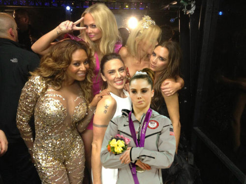
Oh, and the Spice Girls are like a fine wine. They’ve only gotten better with age (…and botox, breast implants, nose jobs and other assorted plastic surgeries).
And speaking of the closing ceremonies, the irony of Jesse J cruising around in back of a Bentley singing “Wanna make the world dance. Forget about the price tag.” is not lost on us, London. I’d want to forget a $14.5 billion price tag, too.
Kerri Strug, you’ve been one-upped. Sure you vaulted with an injured ankle, that takes some determination. Manteo Mitchell ran 200 meters with a broken leg. Sorry, Kerri, your reign as the best broken-limbed Olympic athlete is over.
Sanya Richards-Ross is a woman after my own heart. I consider anyone who can win gold while wearing Chanel a role model.
And, while we’re on running. Oscar Pistorius is without a doubt the most inspirational athlete that ever was.
Who run the world? GIRLS. The United States women won 29 gold medals; the United States men won 17. Womp, womp.
And, last but not least, Nathan Adrian, where have you been all my life?
I’ll leave you with that closing thought as we all wait for Rio – and perhaps another dose of Nathan.
Recently, a friend of mind purchased a pair of these hunter green Gap slim refined pants. The purchase itself was heavily debated, as the slim cut and slightly stretchy fabric led her to purchase the same pair in black a few months ago, but the color present a challenge. Just what exactly can you wear with green pants?
If you’re asking me, which she did, pretty much anything!
This year’s bold color trend has everyone embracing bright and bold as the new neutral. Nearly any color can act as a neutral, pairing well with prints, patterns and even other bright colors. These Gap pants, similar to my favorite J. Crew Minnie pants, have a slim, tailored look which makes them great for work, play and everything in between. Add a funky tee and some bright accessories for a fun, casual look or a printed, ladylike blouse and bold pumps for a night out. Everyone has a white blouse in their closet, making it an easy outfit solution. Button up shirts are office appropriate, but chambray and leopard are an unexpected departure from the norm. Monochromatic looks are also an excellent option. With these hunter green pants, a breezy mint green top would pair perfectly!
Bold color on the bottom doesn’t mean you have to go safe with your choices on top. Just make sure your colors aren’t competing (neon yellow and neon green is an ode to the 80s) and if you do go for a basic top, punch up your look with fun, bright accessories.
The best part? Gap just extended their Friends and Family sale through today, so you can get these pants for 30% off! Enter code “GAPFRIENDS” at checkout for online purchases. Happy shopping!


&quality=90&profile=jpeg)


